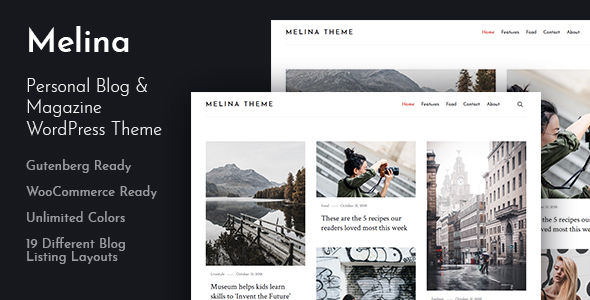
Melina is a clean and modern WordPress theme with an elegant, carefully crafted design. This powerful, responsive blog theme is ideal for your personal or magazine-style blog, whether your passion is travel, beauty, nature, photography, architecture, DIY… the list goes on! Melina will make your WordPress look beautiful everywhere.
The theme was designed with the “mobile first†design, meaning it was designed for mobile from the beginning and was adapted for bigger screen afterward. This result in a beautiful experience for the users, on all devices.
Wide or boxed site layout, unlimited colors, magazine homepage, 5 featured area layouts, 19 different blog listing layouts, different sidebar positions, 2 custom posts layouts, 2 custom page layouts, 2 custom widgets, dozens of configurable options and all of this you can manage with one click of your mouse in user friendly WordPress Customizer or when adding new post or page.
Theme features
- Gutenberg ready.
- WooCommerce ready.
- Clean & Minimal Design.
- Responsive on Mobile Devices.
- Live Customization.
- Wide or boxed site layout.
- 5 elegant featured area layouts:
- Tagline and Header Image.
- Wide Posts Carousel.
- Boxed Posts Carousel.
- Full Width Posts Carousel.
- Full Width Posts Carousel With Transparent Header.
- 19 different blog listing layouts:
- Classic layout.
- List layout.
- Full-width list layout.
- First large then list.
- First large then list (full-width).
- Mixed: large and list.
- Mixed: large and list (full-width).
- Two-column grid layout.
- Two-column grid layout (full-width).
- First large then two-column grid.
- First large then two-column grid (full-width).
- Mixed: large and two-column grid.
- Mixed: large and two-column grid (full-width).
- Three-column full-width grid layout.
- First large then three-column grid (full-width).
- Mixed: large and three-column grid (full-width).
- Mixed: large and small post cards (full-width).
- Three-column full-width masonry layout.
- Mixed three-column full-width masonry layout.
- 2 custom posts layouts.
- 2 custom page layouts.
- 2 custom widgets.
- Custom background.
- Color custom settings.
- Special mobile menu a beautiful menu for mobile users.
- Sidebar or full-width layout control.
- Social links menu.
- Translate the site to your language easily.
- Quick and easy setup.
- Child theme included.
- Free updates for life.
- Quick and friendly support.
- Online Documentation.
Note: Theme used CSS Grid Layout and CSS Variables, therefore it may not display correctly in some browsers. Supported browsers can be viewed at the following links: CSS Grid Layout, CSS Variables.
